Session 6: The Recommendation Problem
“The basic idea of recommender systems is to utilize these various sources of data to infer customer interests.” — Aggarwal, Recommender Systems: The Textbook (2016)
Source
# Setup — run this first
# install deps only if missing (already present via `uv sync`; pip-installs on Colab)
import importlib.util, subprocess, sys
_missing = [p for p in ('pandas', 'matplotlib', 'seaborn') if importlib.util.find_spec(p) is None]
if _missing:
    subprocess.run([sys.executable, '-m', 'pip', 'install', '-q', *_missing], check=False)

import pandas as pd
import numpy as np
import matplotlib.pyplot as plt
import matplotlib.patches as mpatches
import seaborn as sns
import urllib.request, zipfile, os

plt.rcParams.update({
    'figure.figsize': (9, 5),       # slide-friendly default
    'font.size': 12,
    'axes.titlesize': 15,
    'axes.labelsize': 12,
})

if not os.path.exists('ml-latest-small'):
    urllib.request.urlretrieve('https://files.grouplens.org/datasets/movielens/ml-latest-small.zip', 'ml.zip')
    with zipfile.ZipFile('ml.zip','r') as z: z.extractall('.')

ratings = pd.read_csv('ml-latest-small/ratings.csv')
movies  = pd.read_csv('ml-latest-small/movies.csv')
print(f'Loaded {len(ratings):,} ratings  |  {ratings["userId"].nunique()} users  |  {ratings["movieId"].nunique()} movies')
Loaded 100,836 ratings | 610 users | 9724 movies
What does recommendation look like in the real world?
Netflix: ~80 % of watched content comes from recommendations
Amazon: ~35 % of revenue attributed to recommendations
YouTube: ~70 % of watch time from recommendations
Recommendation is the product.
Sources: Netflix — Gomez-Uribe & Hunt, ACM TMIS (2015); Amazon — McKinsey (2013); YouTube — Solsman, CNET (2018).
A bit of formalism
The same idea in symbols — these are the variables you’ll meet in every recommender-systems paper or textbook (Aggarwal 2016, Falk 2018):
— set of users
— set of items
— the rating matrix, where is the rating user gave item (or if missing)
A recommender system solves one of two tasks:
| Task | What | As a function |
|---|---|---|
| Rating prediction | Fill in the missing | (regression) or (classification) |
| Ranking prediction | For user , return the top- items they’ll like most |
Ranking can be reduced to rating prediction — predict every score, then sort — but it’s often optimized directly, and a low rating-prediction error (RMSE) does not guarantee a good ranking.
The Rating Matrix
Every recommender system is built on a rating matrix: rows = users, columns = items, values = ratings (mostly missing).
MovieLens (small) at a glance
The concrete dataset behind every plot in this lecture.
Source
# --- dataset stat cards ---
n_ratings = len(ratings)
n_users   = ratings['userId'].nunique()
n_movies  = ratings['movieId'].nunique()
sparsity  = 1 - n_ratings / (n_users * n_movies)
avg_u, avg_m = n_ratings / n_users, n_ratings / n_movies

cards = [
    (f'{n_ratings:,}',          'ratings',                      '#1976d2'),
    (f'{n_users:,}',            'users',                        '#388e3c'),
    (f'{n_movies:,}',           'movies',                       '#f57c00'),
    ('0.5 – 5.0',               'rating scale (½-star steps)',  '#7b1fa2'),
    (f'{sparsity:.1%}',         'of the matrix is empty',       '#d32f2f'),
    (f'{avg_u:.0f} / {avg_m:.0f}', 'avg ratings per user / movie', '#0097a7'),
]
fig, ax = plt.subplots(figsize=(11, 4)); ax.axis('off')
ax.set_xlim(0, 3); ax.set_ylim(0, 2)
for idx, (num, lab, col) in enumerate(cards):
    cx, cy = idx % 3, 1 - idx // 3
    ax.add_patch(plt.Rectangle((cx + 0.05, cy + 0.05), 0.9, 0.9,
                 facecolor=col, alpha=0.12, edgecolor=col, lw=2))
    ax.text(cx + 0.5, cy + 0.60, num, ha='center', va='center',
            fontsize=21, fontweight='bold', color=col)
    ax.text(cx + 0.5, cy + 0.27, lab, ha='center', va='center', fontsize=11, color='#333')
ax.set_title('MovieLens (small) — the dataset we use all lecture', fontsize=14, fontweight='bold')
plt.tight_layout(); plt.show()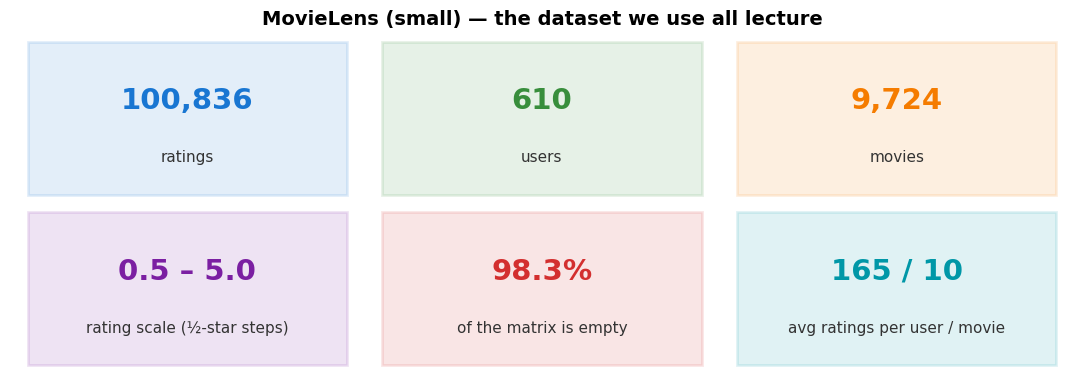
Source
# Build the rating matrix once for the rest of the lecture
R = ratings.pivot_table(index='userId', columns='movieId', values='rating')
A small corner — what real ratings look like
Twelve users × twelve movies. Coloured cells are actual star ratings (0.5 – 5). White cells are missing — nobody rated those.
Source
fig, ax = plt.subplots(figsize=(8, 6))
small = R.iloc[:12, :12]
sns.heatmap(small, annot=True, fmt='.1f', cmap='YlOrRd', cbar=False,
            linewidths=0.5, linecolor='gray', ax=ax,
            mask=small.isna(), annot_kws={'size': 11})
ax.set_title('Rating Matrix — a small corner')
ax.set_xlabel('Movie ID'); ax.set_ylabel('User ID')
plt.tight_layout(); plt.show()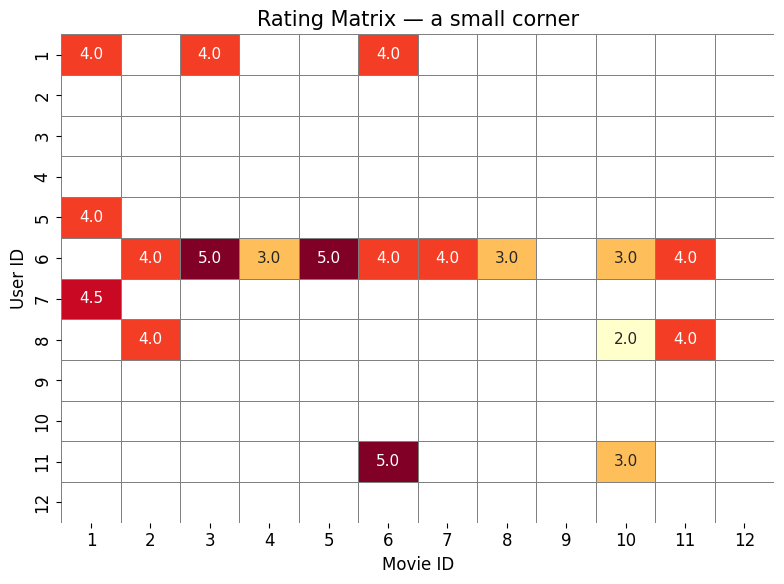
Zooming out — where do we have ratings at all?
Now 80 users × 200 movies. Each black dot is a rating that exists; white is missing. Most of the space is empty — that’s the core challenge of recommendation.
Source
fig, ax = plt.subplots(figsize=(9, 5))
sample_R = R.iloc[:80, :200]
ax.imshow(~sample_R.isna(), cmap='Greys', aspect='auto', interpolation='none')
ax.set_title('Where do we have ratings? (80 users × 200 movies)')
ax.set_xlabel('Movies →'); ax.set_ylabel('Users →')
plt.tight_layout(); plt.show()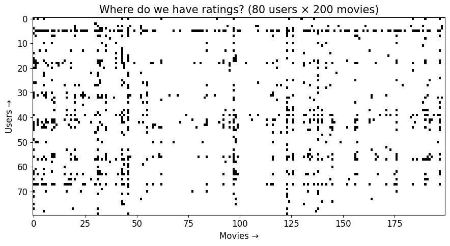
Types of Feedback
Ratings aren’t the only signal. Users leave traces in many forms — each shapes how the matrix is built.
Explicit feedback — star ratings
The user gives an explicit numeric score — the cleanest signal, but expensive to collect (most users never rate). And the scores that do arrive are skewed high: people mostly rate things they already liked (a selection bias).
Source
fig, ax = plt.subplots(figsize=(8, 4.5))
# all ten half-star levels (0.5 ... 5.0) -- not just whole stars
vc = ratings['rating'].value_counts().sort_index()
colors = plt.cm.RdYlGn(np.linspace(0.15, 0.9, len(vc)))
ax.bar(vc.index, vc.values, width=0.4, color=colors, edgecolor='white')
mean_r = ratings['rating'].mean()
ax.axvline(mean_r, color='black', linestyle='--', linewidth=2, label=f'Mean: {mean_r:.2f}')
ax.set_title('Explicit — star ratings (MovieLens, all half-steps)', fontweight='bold')
ax.set_xlabel('Rating'); ax.set_ylabel('Count')
ax.set_xticks(np.arange(0.5, 5.5, 0.5))
ax.legend(); ax.spines[['top','right']].set_visible(False)
plt.tight_layout(); plt.show()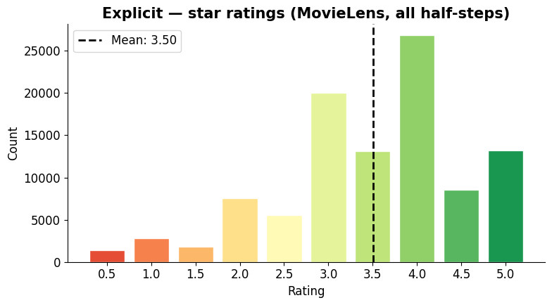
Implicit feedback — clicks, time spent, page views
The user never explicitly rates anything — we infer interest from behaviour. Much more abundant, but noisier (a click isn’t a “like”).
Source
fig, ax = plt.subplots(figsize=(7, 4.5))
np.random.seed(42)
views = np.random.exponential(5, 200)
ax.hist(views, bins=20, color='#1976d2', edgecolor='white')
ax.set_title('Implicit — page views per item (simulated)', fontweight='bold')
ax.set_xlabel('View count'); ax.set_ylabel('Items')
ax.spines[['top','right']].set_visible(False)
plt.tight_layout(); plt.show()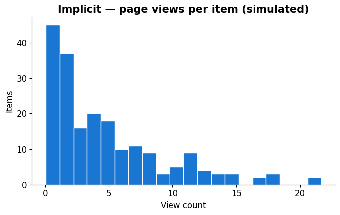
Binary feedback — like / dislike
Thumbs up or down only. Throws away rating magnitude but is much easier for users — and matches how YouTube and Spotify now work.
Source
fig, ax = plt.subplots(figsize=(6, 4.5))
ax.bar(['Dislike', 'Like'], [320, 680], color=['#d32f2f', '#388e3c'], edgecolor='white', width=0.5)
ax.set_title('Binary — like / dislike (illustrative)', fontweight='bold')
ax.set_ylabel('Count')
ax.spines[['top','right']].set_visible(False)
plt.tight_layout(); plt.show()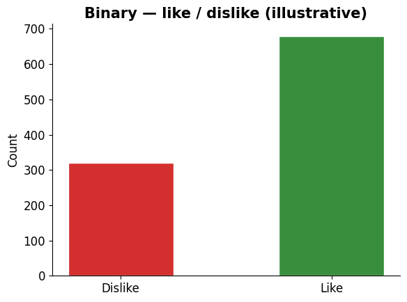
Ordinal feedback — categories with order
Bad / neutral / good — fewer levels than stars, more nuance than binary. Common in surveys and quick UI polls.
Source
fig, ax = plt.subplots(figsize=(6, 4.5))
ax.bar(['Bad', 'Neutral', 'Good'], [150, 300, 550],
       color=['#d32f2f','#fbc02d','#388e3c'], edgecolor='white', width=0.5)
ax.set_title('Ordinal — categories with order (illustrative)', fontweight='bold')
ax.set_ylabel('Count')
ax.spines[['top','right']].set_visible(False)
plt.tight_layout(); plt.show()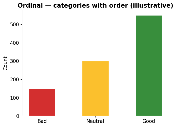
Different Data Modalities
Recommendations involve more than numbers. We work with text, images, and tabular data — each needs a different strategy to become a computable vector.
Text data — e.g. review word frequencies
Words become numbers via word counts, TF-IDF, or (later in the course) sentence-embedding vectors.
Source
fig, ax = plt.subplots(figsize=(7, 5))
words = ['great','movie','acting','plot','boring','love','fun','slow','amazing','bad']
freq  = [45, 38, 25, 22, 18, 30, 15, 12, 28, 10]
order = np.argsort(freq)                       # smallest first -> largest ends on top
words = [words[i] for i in order]; freq = [freq[i] for i in order]
ax.barh(words, freq, color='#1976d2', edgecolor='white')
ax.set_title('Text Data — review word frequencies', fontweight='bold')
ax.set_xlabel('Count')
ax.spines[['top','right']].set_visible(False)
plt.tight_layout(); plt.show()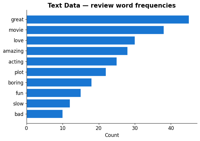
Image data — e.g. a painting → pixel values
An image is a 3-D array: height × width × 3 colour channels (red, green, blue). Every pixel stores 3 numbers — the painting below is a grid of values.
Isn’t there a saturation/brightness channel? Not in RGB. Saturation and brightness are the axes of a different 3-channel encoding, HSV (Hue, Saturation, Value = brightness) — the same image, just re-encoded. Images can also carry a 4th alpha (transparency) channel → RGBA.
Source
# a real, recognisable image split into its three colour channels
import matplotlib.cbook as cbook, os
photo = None
for p in ['../figures/starry_night.jpg', 'figures/starry_night.jpg', 'starry_night.jpg']:
    if os.path.exists(p):
        photo = plt.imread(p); break
if photo is None:                       # fallback so the build never breaks
    photo = plt.imread(cbook.get_sample_data('grace_hopper.jpg', asfileobj=True))

fig, axes = plt.subplots(1, 4, figsize=(12, 3.6))
axes[0].imshow(photo)
axes[0].set_title(f'RGB image\n{photo.shape[0]} × {photo.shape[1]} × 3', fontweight='bold')
for k, (name, cm) in enumerate(zip(['Red', 'Green', 'Blue'], ['Reds', 'Greens', 'Blues']), start=1):
    axes[k].imshow(photo[:, :, k-1], cmap=cm, vmin=0, vmax=255)
    axes[k].set_title(f'{name} channel', fontweight='bold')
for ax in axes:
    ax.set_xticks([]); ax.set_yticks([])
plt.tight_layout(); plt.show()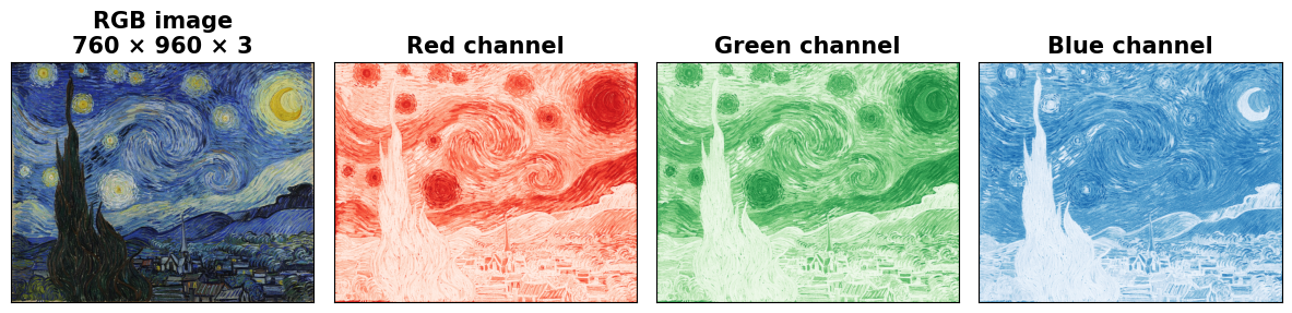
Tabular / ordinal data — e.g. genre scores per item
Hand-crafted attribute vectors. The most direct form — every column is already a number.
Source
fig, ax = plt.subplots(figsize=(7, 4.5))
# Illustrative attribute vectors. Length = runtime / longest runtime (Titanic, 195 min):
# Star Wars 121, Titanic 195, Matrix 136, Pride & Prejudice 129 (minutes)
table_data = pd.DataFrame({
    'Action':  [0.9, 0.2, 0.8, 0.1],
    'Romance': [0.1, 0.9, 0.2, 0.8],
    'Sci-Fi':  [0.8, 0.1, 0.7, 0.0],
    'Length':  [0.62, 1.00, 0.70, 0.66],
}, index=['Star Wars', 'Titanic', 'Matrix', 'Pride & P.'])
sns.heatmap(table_data, annot=True, cmap='YlOrRd', cbar=False, ax=ax,
            linewidths=1, linecolor='white', fmt='.2f')
ax.set_title('Tabular — genre + length scores per movie', fontweight='bold')
plt.tight_layout(); plt.show()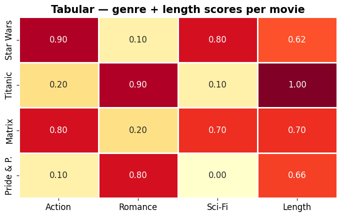
Each modality needs its own strategy to turn into a vector.
Problem 1: Sparsity
We just saw the matrix looks mostly empty — now let’s put a number on it. How much of the MovieLens rating matrix is actually filled?
Source
total  = R.shape[0] * R.shape[1]
filled = int(R.notna().sum().sum())
empty  = total - filled
sparsity = empty / total

fig, ax = plt.subplots(figsize=(11, 2.8))
fp = filled / total * 100
ax.barh([0], [fp], color='#d32f2f', edgecolor='white')
ax.barh([0], [100 - fp], left=[fp], color='#e0e0e0', edgecolor='white')
ax.set_xlim(0, 100); ax.set_ylim(-0.6, 1.0); ax.set_yticks([])
ax.set_xlabel('share of all (user, movie) cells (%)')
ax.text(fp + (100 - fp) / 2, 0, f'EMPTY  {sparsity:.1%}\n({empty:,} cells)',
        ha='center', va='center', fontsize=13, color='#555', fontweight='bold')
ax.annotate(f'Filled  {1 - sparsity:.1%}\n({filled:,} ratings)',
            xy=(fp, 0.0), xytext=(10, 0.62), fontsize=11, color='#d32f2f', fontweight='bold',
            arrowprops=dict(arrowstyle='->', color='#d32f2f'))
ax.set_title(f'Only {filled:,} of {total:,} possible (user × movie) cells hold a rating',
             fontsize=13, fontweight='bold')
ax.spines[['top','right','left']].set_visible(False)
plt.tight_layout(); plt.show()
print(f'→ {sparsity:.1%} of the matrix is empty. Standard ML methods can\'t handle this directly.')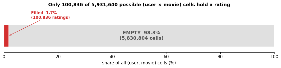
→ 98.3% of the matrix is empty. Standard ML methods can't handle this directly.
Problem 2: The Long Tail
A handful of popular items get most of the ratings. The vast majority — the “long tail” — get very few.
Source
ratings_per_movie = ratings.groupby('movieId')['rating'].count().sort_values(ascending=False)

fig, ax = plt.subplots(figsize=(10, 4.5))
x = range(len(ratings_per_movie)); y = ratings_per_movie.values
head_cutoff = int(len(y) * 0.1)
ax.fill_between(x[:head_cutoff], y[:head_cutoff], alpha=0.7, color='#d32f2f',
                label=f'Head (top 10 %): {head_cutoff} movies')
ax.fill_between(x[head_cutoff:], y[head_cutoff:], alpha=0.5, color='#1976d2',
                label=f'Long Tail (90 %): {len(y)-head_cutoff} movies')
ax.plot(x, y, color='black', linewidth=0.8)

top_movie_id = ratings_per_movie.index[0]
top_title = movies[movies['movieId']==top_movie_id]['title'].values[0]
ax.annotate(f'Most rated:\n{top_title[:30]}\n({y[0]} ratings)',
            xy=(0, y[0]), xytext=(150, y[0]*0.85),
            fontsize=9, arrowprops=dict(arrowstyle='->', color='black'),
            bbox=dict(boxstyle='round,pad=0.3', facecolor='yellow', alpha=0.8))
ax.axhline(y=10, color='gray', linestyle=':', alpha=0.7)
ax.text(len(y)*0.6, 15, '← movies with < 10 ratings', fontsize=9, color='gray')
ax.set_title('The Long Tail Problem', fontsize=15, fontweight='bold')
ax.set_xlabel('Movies (sorted by popularity)')
ax.set_ylabel('Number of ratings')
ax.legend(fontsize=10)
ax.spines[['top','right']].set_visible(False)
plt.tight_layout(); plt.show()

tail = (ratings_per_movie < 10).sum()
print(f'→ {tail} of {len(ratings_per_movie)} movies ({tail/len(ratings_per_movie):.0%}) have < 10 ratings.')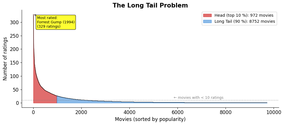
→ 7455 of 9724 movies (77%) have < 10 ratings.
Problem 3: Cold Start
What happens when a user or an item is brand new — no rating history at all?
What cold start looks like in the matrix
A brand-new user is an empty row; a brand-new item is an empty column. There is nothing to learn from.
Source
# --- cold-start illustration: one empty row + one empty column ---
rng = np.random.default_rng(3)
CS = rng.choice([np.nan, 2, 3, 4, 5], size=(6, 7), p=[0.4, 0.15, 0.2, 0.15, 0.1]).astype(float)
CS[3, :] = np.nan      # new user  -> whole row empty
CS[:, 5] = np.nan      # new item  -> whole column empty
ulabels = [f'User {i+1}' for i in range(6)]; ulabels[3] = 'New user'
mlabels = [f'M{i+1}' for i in range(7)];     mlabels[5] = 'New item'

fig, ax = plt.subplots(figsize=(8.5, 4.8))
sns.heatmap(CS, annot=True, fmt='.0f', cmap='YlOrRd', cbar=False, mask=np.isnan(CS),
            xticklabels=mlabels, yticklabels=ulabels,
            linewidths=1, linecolor='#ddd', ax=ax, annot_kws={'size': 11})
ax.add_patch(plt.Rectangle((0, 3), 7, 1, fill=False, edgecolor='#d32f2f', lw=3))
ax.add_patch(plt.Rectangle((5, 0), 1, 6, fill=False, edgecolor='#1976d2', lw=3))
# annotations placed clear of the tick labels
ax.text(7.25, 3.5, 'new user:\nno ratings', color='#d32f2f', va='center', ha='left',
        fontsize=10, fontweight='bold')
ax.text(5.5, -0.55, 'new item: no ratings', color='#1976d2', ha='center', va='bottom',
        fontsize=10, fontweight='bold')
ax.set_title('Cold start = an empty row (new user) or empty column (new item)', fontweight='bold')
plt.tight_layout(); plt.show()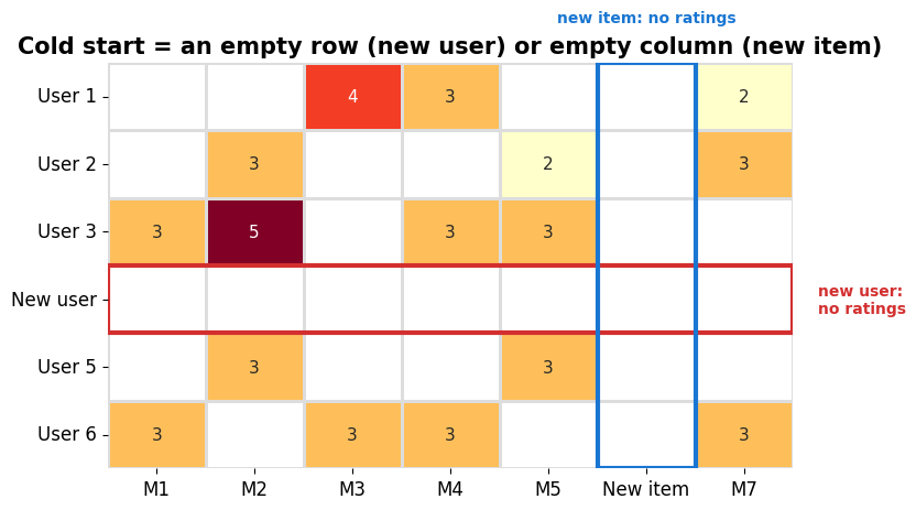
Cold-start users? Not in this dataset
MovieLens-small only keeps users who have rated at least 20 movies, so it has no cold-start users by construction. Real systems aren’t so lucky — we’ll simulate a brand-new user in the CF example later.
Source
ratings_per_user = ratings.groupby('userId')['rating'].count()
fig, ax = plt.subplots(figsize=(8, 4.5))
ax.hist(ratings_per_user, bins=50, color='#1976d2', edgecolor='white')
ax.axvline(x=ratings_per_user.min(), color='#d32f2f', linestyle='--', linewidth=2,
           label=f'Fewest by any user: {ratings_per_user.min()} ratings')
ax.set_title('Ratings per User — the dataset floors everyone at 20', fontweight='bold')
ax.set_xlabel('Number of ratings'); ax.set_ylabel('Number of users')
ax.legend(); ax.spines[['top','right']].set_visible(False)
plt.tight_layout(); plt.show()
print(f'→ Minimum ratings by any user: {ratings_per_user.min()}. MovieLens filters cold-start users out.')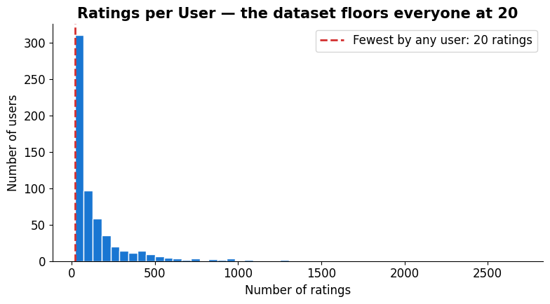
→ Minimum ratings by any user: 20. MovieLens filters cold-start users out.
Cold-start items — these are real
Movies have no such floor: the least-rated have a single rating. 62 % of movies have fewer than 5 ratings — far too few to learn from.
Source
fig, ax = plt.subplots(figsize=(8, 4.5))
ax.hist(ratings_per_movie, bins=50, color='#388e3c', edgecolor='white')
ax.axvline(x=5, color='#d32f2f', linestyle='--', linewidth=2, label='Cold-start threshold (5)')
cold_movies = (ratings_per_movie < 5).sum()
ax.set_title(f'Ratings per Movie — {cold_movies} cold-start movies ({cold_movies/len(ratings_per_movie):.0%})',
             fontweight='bold')
ax.set_xlabel('Number of ratings'); ax.set_ylabel('Number of movies')
ax.legend(); ax.spines[['top','right']].set_visible(False)
plt.tight_layout(); plt.show()
print('→ New users and rarely-rated movies: not enough data to make good predictions.')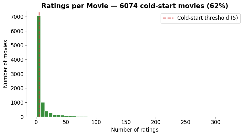
→ New users and rarely-rated movies: not enough data to make good predictions.
The Netflix Prize — a $1M bounty on these problems
Sparsity, long tail, cold start — a real, costly problem. In October 2006 Netflix turned it into the most famous ML competition in history.
| Prize | $1,000,000 |
| Data | 100M ratings · 480k users × 18k movies |
| Sparsity | ~98.8 % empty |
| Goal | beat Cinematch by ≥ 10 % RMSE |
| Ran | 2006 – 2009 |
Winner: BellKor’s Pragmatic Chaos
No single magic algorithm — the winner blended hundreds of models:
mostly matrix factorization variants (SVD++, timeSVD++, …) → Lecture 8
plus neighbourhood / k-NN models (like the CF we just saw)
plus early neural nets (RBMs)
Combined in layers (“stacking”). Matrix factorization did the heavy lifting.
Precisely: a linear blend of hundreds of predictors — MF variants (SVD++, timeSVD++, asymmetric SVD, NSVD1, NNMF), neighbourhood/k-NN models and RBMs, stacked via gradient-boosted trees and other non-linear blenders.
The photo finish (2009)
Two scores, two stories — and the held-out test set, not the public leaderboard, is what paid out:
Source
# --- Netflix Prize 2009: quiz set (public) vs test set (decides the prize) ---
groups   = ['Quiz set\n(public leaderboard)', 'Test set\n(decides the prize)']
bellkor  = [10.09, 10.06]
ensemble = [10.10, 10.06]
x = np.arange(2); w = 0.34

fig, ax = plt.subplots(figsize=(9.5, 4.0))
b1 = ax.bar(x - w/2, bellkor,  w, label="BellKor's Pragmatic Chaos", color='#e6b800', edgecolor='white')
b2 = ax.bar(x + w/2, ensemble, w, label='The Ensemble',              color='#90a4ae', edgecolor='white')

ax.axhline(10.0, color='#d32f2f', linestyle='--', lw=2)
ax.text(-0.45, 10.004, '10 % qualifying goal', color='#d32f2f', ha='left', va='bottom',
        fontsize=9, fontweight='bold')
ax.set_ylim(9.9, 10.18)
ax.set_xticks(x); ax.set_xticklabels(groups)
ax.set_ylabel('% RMSE improvement\nover Cinematch')
ax.set_title('Netflix Prize 2009 — public board vs. the score that counted', fontweight='bold')

for bars in (b1, b2):
    for b in bars:
        ax.text(b.get_x() + b.get_width()/2, b.get_height() + 0.004, f'{b.get_height():.2f}%',
                ha='center', va='bottom', fontsize=10, fontweight='bold')

ax.annotate('Ensemble led\nby 0.01%', xy=(0.17, 10.10), xytext=(0.17, 10.145),
            fontsize=8.5, color='#555', ha='center', arrowprops=dict(arrowstyle='->', color='#888'))
ax.annotate('exact tie -> earlier submission\nwins -> BellKor takes the $1M', xy=(1.0, 10.06),
            xytext=(1.0, 10.125), fontsize=8.5, color='#a07800', ha='center',
            arrowprops=dict(arrowstyle='->', color='#a07800'))

ax.legend(loc='center left', bbox_to_anchor=(1.01, 0.5), fontsize=9, frameon=False)
ax.spines[['top','right']].set_visible(False)
plt.tight_layout(); plt.show()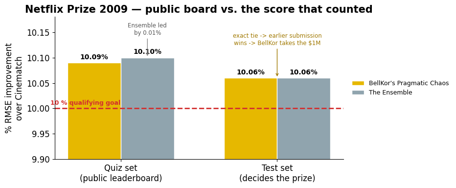
A First Attempt: Collaborative Filtering
Before we look at our roadmap, let’s see what people tried directly on the rating matrix: Collaborative Filtering (CF).
User-based CF: “Users who rated similarly to you also liked X” — find your rating-twins, borrow their opinions
Item-based CF: “Movies that got similar ratings tend to be similar” — if people who liked A also liked B, recommend B
This powered early Amazon and Netflix.
We’ll work through user-based CF below; item-based is the same idea with the matrix transposed.
A tiny example — can we predict the “?”
Four users, five movies. You haven’t rated “Saw”. Alice and Bob have similar taste to you; Carol’s is opposite. What rating would you give?
Source
cf_users  = ['Alice', 'Bob', 'Carol', 'You']
cf_movies = ['Toy Story', 'Shrek', 'Saw', 'Up', 'WALL-E']
cf_data = np.array([
    [5,   4,   1,    2,   1],      # Alice
    [4,   5,   2,    1,   2],      # Bob
    [1,   2,   5,    5,   5],      # Carol
    [5,   3, np.nan, 1, np.nan],   # You
])

fig, ax = plt.subplots(figsize=(7, 4.5))
sns.heatmap(cf_data, annot=True, fmt='.0f', cmap='YlOrRd', cbar=False,
            linewidths=1, linecolor='white', ax=ax,
            xticklabels=cf_movies, yticklabels=cf_users,
            mask=np.isnan(cf_data), annot_kws={'size': 13, 'fontweight': 'bold'})
ax.add_patch(plt.Rectangle((2, 3), 1, 1, fill=False, edgecolor='#1976d2', lw=3))
ax.text(2.5, 3.75, '?', ha='center', va='bottom', fontsize=18, fontweight='bold', color='#1976d2')
ax.set_title('User-based CF: predict the "?"', fontweight='bold')
plt.tight_layout(); plt.show()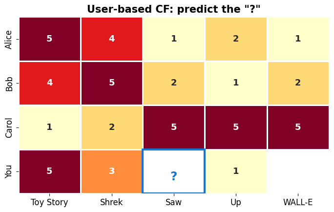
Collaborative filtering in three steps
CF works directly on the rating matrix — no movie features needed:
(offline) Compute similarity for every user pair → fill the user–user matrix (users × users), where .
(online) Find neighbours: take the target user’s most similar users.
(online) Predict the missing rating from what those neighbours rated.
The whole game is Step 1: how do we define ?
Source
# --- schematic: rating matrix R  ->  user-user matrix U-hat ---
fig, axes = plt.subplots(1, 2, figsize=(11, 4))
sns.heatmap(cf_data, annot=True, fmt='.0f', cmap='YlOrRd', cbar=False, ax=axes[0],
            xticklabels=cf_movies, yticklabels=cf_users, mask=np.isnan(cf_data),
            linewidths=1, linecolor='white', annot_kws={'size': 12, 'fontweight': 'bold'})
axes[0].set_title('Rating matrix  R\n(users × items)', fontweight='bold')

sns.heatmap(np.zeros((4, 4)), cmap='Blues', vmin=0, vmax=1, cbar=False, ax=axes[1],
            xticklabels=cf_users, yticklabels=cf_users, linewidths=1, linecolor='#ccc')
for x in range(4):
    for y in range(4):
        txt = '1.0' if x == y else '?'
        axes[1].text(x + 0.5, y + 0.5, txt, ha='center', va='center',
                     fontsize=13, fontweight='bold', color='#888' if x == y else '#1976d2')
axes[1].set_title('User–user matrix  Û\n(users × users) — to fill in', fontweight='bold')
fig.text(0.5, 0.5, '→', fontsize=34, ha='center', va='center')
plt.tight_layout(); plt.show()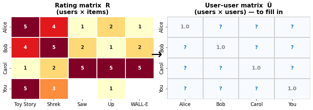
Measuring similarity — attempt 1: dot product
Treat each user’s ratings as a vector and take the dot product:
❌ Problem: the matrix is mostly empty — for almost any pair, most items are rated by only one of them (or neither), so most products involve a missing value. The plain dot product isn’t even well-defined.
Fix 1 — only the items both users rated
Restrict the sum to the common itemset (items both rated):
❌ Problem: user bias. A generous rater who gives everything 4–5 ★ looks similar to everyone. We’re comparing rating levels, not taste.
Fix 2 — subtract each user’s average (de-bias)
Center each user on their own mean , so we compare deviations from what is normal for them:
Now a grump and an enthusiast with the same taste line up. ❌ Last problem: the sum still grows with scale — the more items the two co-rate, or the more extremely they rate, the bigger it gets, regardless of how well they actually agree.
Fix 3 — normalise → this is Pearson correlation
Why divide by the lengths? The raw sum on top isn’t comparable between pairs: it gets bigger when the two users co-rate more items (more terms in the sum) or simply rate more extremely — neither of which means they actually agree more. Dividing by both vector lengths cancels that scale, putting every pair on the same footing — so we compare the shape of their agreement, not its size.
That’s exactly the cosine of the angle between the two rating vectors — i.e. Pearson correlation: +1 identical taste, 0 unrelated, -1 opposite.
Step 1: Pearson’s correlation coefficient
Written out over the common items :
It’s the statistician’s on the two users’ co-rated ratings. Intuition: when you rate a film above your average, does tend to be above theirs too? Consistent agreement → near +1. Do this for every pair → the matrix .
Step 2: find the top- nearest neighbours
With filled in, the peer group is just user ’s most similar users — k-nearest-neighbours on the similarity matrix.
| Alice | Bob | Carol | |
|---|---|---|---|
| You | +0.98 | +0.72 | -0.96 |
For You, the nearest neighbours are Alice and Bob. (Our example is tiny, so we keep all three as the peer group — Carol’s negative similarity simply pulls the estimate down.)
Step 3: predict — a similarity-weighted average
First bundle the normaliser into one weight per neighbour, scaled by the total similarity so the weights’ magnitudes sum to 1:
Now the prediction is just your baseline + a weighted average of the neighbours’ de-biased opinions:
A similar neighbour gets a large ; an opposite-taste one gets a negative weight that flips their vote. The term is ’s opinion of relative to their own average.
Worked example — similarity of You to each user
Apply Pearson to our 4-user example. Alice and Bob come out positive (same taste); Carol negative (opposite taste).
Source
target_user = 3   # "You"
target_item = 2   # "Saw"
you = cf_data[target_user]

similarities = {}
for i in range(3):
    other = cf_data[i]
    mask = ~np.isnan(you) & ~np.isnan(other)
    y, o = you[mask], other[mask]
    y_c, o_c = y - y.mean(), o - o.mean()
    sim = np.dot(y_c, o_c) / (np.linalg.norm(y_c) * np.linalg.norm(o_c))
    similarities[cf_users[i]] = round(sim, 2)

fig, ax = plt.subplots(figsize=(7, 4))
names = list(similarities.keys()); sims = list(similarities.values())
bar_colors = ['#388e3c' if s > 0 else '#d32f2f' for s in sims]
ax.barh(names, sims, color=bar_colors, edgecolor='white', height=0.5)
ax.set_xlim(-1.15, 1.15)
ax.axvline(x=0, color='gray', linestyle='-', alpha=0.3)
ax.set_title('Step 1 — Similarity to You  (Pearson)', fontweight='bold')
for n, s in zip(names, sims):
    ha = 'left' if s >= 0 else 'right'
    ax.text(s + 0.08 * np.sign(s), n, f'{s:+.2f}', va='center', ha=ha,
            fontweight='bold', fontsize=12, color=bar_colors[names.index(n)])
ax.spines[['top','right']].set_visible(False)
plt.tight_layout(); plt.show()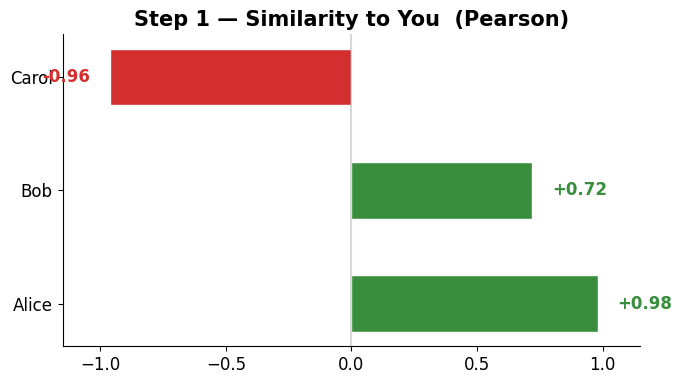
Worked example — the neighbours’ ratings for Saw
Alice and Bob (positive similarity) rated it low. Carol (negative similarity) rated it high — but her negative weight flips that into downward pressure.
Source
fig, ax = plt.subplots(figsize=(6, 4))
saw_ratings = {cf_users[i]: cf_data[i, target_item] for i in range(3)}
names = list(saw_ratings.keys())
ax.bar(names, [saw_ratings[n] for n in names],
       color='#1976d2', edgecolor='white', width=0.5)
ax.set_ylim(0, 5.8)
ax.set_title('Step 2 — Neighbours\' rating for "Saw"', fontweight='bold')
ax.set_ylabel('Rating')
for j, n in enumerate(names):
    ax.text(j, saw_ratings[n] + 0.2, f'{saw_ratings[n]:.0f} ★',
            ha='center', fontweight='bold', fontsize=13)
ax.spines[['top','right']].set_visible(False)
plt.tight_layout(); plt.show()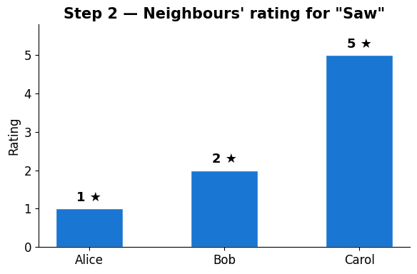
Worked example — the predicted rating
Plug the similarities and ratings into the formula. Result: You probably won’t like horror, because your rating-twins didn’t.
Source
mu_you = np.nanmean(you)
numerator, denominator = 0, 0
for i in range(3):
    w = similarities[cf_users[i]]
    mu_v = np.mean(cf_data[i])
    r_vi = cf_data[i, target_item]
    numerator += w * (r_vi - mu_v)
    denominator += abs(w)
predicted = mu_you + numerator / denominator

fig, ax = plt.subplots(figsize=(6, 4.5))
ax.text(0.5, 0.78, 'Predicted rating  You → "Saw"', ha='center', va='center',
        fontsize=14, transform=ax.transAxes, fontweight='bold')
color_pred = '#388e3c' if predicted >= 3 else '#d32f2f'
ax.text(0.5, 0.45, f'{predicted:.1f} / 5', ha='center', va='center',
        fontsize=48, transform=ax.transAxes, fontweight='bold', color=color_pred)
ax.text(0.5, 0.12,
        f'Alice ({similarities["Alice"]:+.2f}) rated 1   ·   Bob ({similarities["Bob"]:+.2f}) rated 2\n'
        f'Carol ({similarities["Carol"]:+.2f}) rated 5 — but opposite taste',
        ha='center', va='center', fontsize=10, transform=ax.transAxes, color='#555')
ax.axis('off')
plt.tight_layout(); plt.show()
print(f'→ Prediction: {predicted:.1f}/5')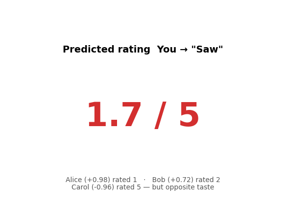
→ Prediction: 1.7/5
But what about cold start?
CF needs overlapping ratings between users. What happens when a user is new?
Two new users join — Dave and Eve
Dave has rated just one movie. Eve hasn’t rated anything yet. The red dashed box shows the “cold start” rows.
Source
cf_users_cs = ['Alice', 'Bob', 'Carol', 'You', 'Dave\n(1 rating)', 'Eve\n(brand new)']
cf_data_cs = np.array([
    [5,   4,   1,   2,   1],
    [4,   5,   2,   1,   2],
    [1,   2,   5,   5,   5],
    [5,   3, np.nan, 1, np.nan],
    [5, np.nan, np.nan, np.nan, np.nan],
    [np.nan]*5,
])

fig, ax = plt.subplots(figsize=(8, 5))
sns.heatmap(cf_data_cs, annot=True, fmt='.0f', cmap='YlOrRd', cbar=False,
            linewidths=1, linecolor='white', ax=ax,
            xticklabels=cf_movies, yticklabels=cf_users_cs,
            mask=np.isnan(cf_data_cs), annot_kws={'size': 12, 'fontweight': 'bold'})
ax.add_patch(plt.Rectangle((0, 4), 5, 2, fill=False, edgecolor='#d32f2f', lw=3, linestyle='--'))
ax.text(5.1, 5, 'Cold\nstart!', va='center', fontsize=12, fontweight='bold', color='#d32f2f')
ax.set_title('Rating matrix with new users', fontweight='bold')
plt.tight_layout(); plt.show()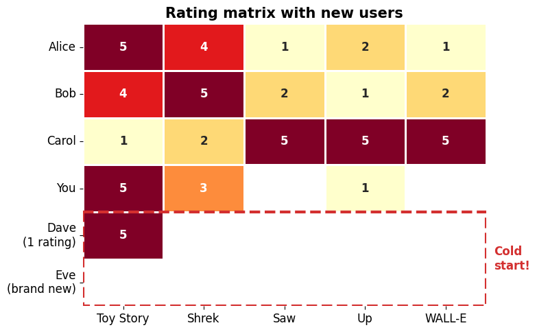
Can CF still find neighbours?
Pearson correlation needs at least 2 co-rated items. Dave has just 1; Eve has 0. CF is completely blind for them.
Source
alice = cf_data_cs[0]
user_labels = ['You\n(3 ratings)', 'Dave\n(1 rating)', 'Eve\n(0 ratings)']
co_rated = []; can_compute = []
for idx in [3, 4, 5]:
    u = cf_data_cs[idx]
    overlap = int(np.sum(~np.isnan(u) & ~np.isnan(alice)))
    co_rated.append(overlap); can_compute.append(overlap >= 2)

fig, ax = plt.subplots(figsize=(7, 4.5))
bar_colors = ['#388e3c' if c else '#d32f2f' for c in can_compute]
bars = ax.bar(user_labels, co_rated, color=bar_colors, edgecolor='white', width=0.5)
ax.axhline(y=2, color='#d32f2f', linestyle='--', linewidth=2, alpha=0.6)
ax.text(2.35, 2.15, 'minimum for\nPearson correlation', fontsize=10, color='#d32f2f', ha='right')
ax.set_ylim(0, 4.5)
ax.set_ylabel('Co-rated movies with Alice')
ax.set_title('Can CF find neighbours?', fontweight='bold')
ax.spines[['top','right']].set_visible(False)
verdicts = ['Yes', 'No!', 'No!']
for bar, v, c in zip(bars, verdicts, bar_colors):
    ax.text(bar.get_x() + bar.get_width()/2, bar.get_height() + 0.15,
            v, ha='center', fontweight='bold', fontsize=13, color=c)
plt.tight_layout(); plt.show()
print('→ Dave: 1 rating → cannot compute similarity.')
print('  Eve: 0 ratings → CF is completely blind.')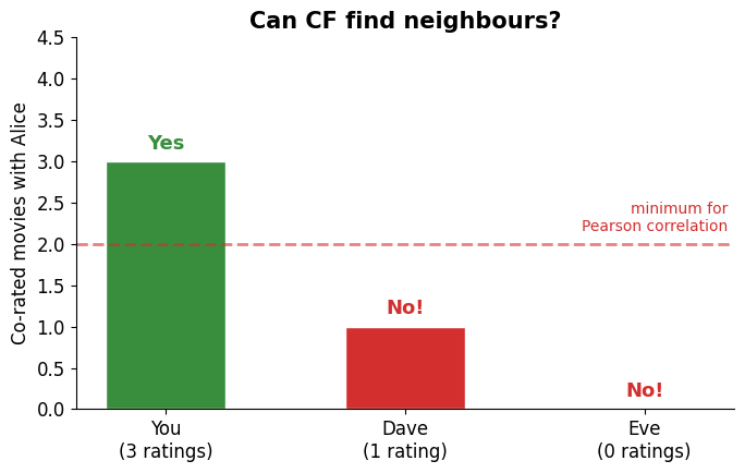
→ Dave: 1 rating → cannot compute similarity.
  Eve: 0 ratings → CF is completely blind.
Cold start is one of the reasons we’ll move beyond the rating matrix in the coming lectures — from hand-crafted feature vectors (L7) to learned latent factors (L8) to neural embeddings (L9–10).
The Roadmap
From sparse matrix → vectors → learned embeddings → cluster-scale retrieval.
Source
fig, ax = plt.subplots(figsize=(11, 3.2))
ax.set_xlim(0, 10); ax.set_ylim(0, 2); ax.axis('off')
lectures = [
    ('6\nThe Problem',     '#d32f2f', 'Sparse matrix,\ndata types'),
    ('7\nContent-Based',   '#f57c00', 'Data as vectors,\nsimilarity'),
    ('8\nMatrix Fact.',    '#fbc02d', 'Latent factors,\nSVD'),
    ('9\nEmbeddings +\nVector DB', '#7cb342', 'Neural vectors,\nChromaDB'),
    ('10\nCluster\nPipeline', '#1976d2', 'Scale up,\nevaluate'),
]
for i, (label, color, desc) in enumerate(lectures):
    x = 1 + i * 1.8
    ax.add_patch(plt.Circle((x, 1.2), 0.45, color=color, zorder=3))
    ax.text(x, 1.2, label, ha='center', va='center', fontsize=8, fontweight='bold', color='white', zorder=4)
    ax.text(x, 0.35, desc, ha='center', va='center', fontsize=8, color='#333')
    if i < 4:
        ax.annotate('', xy=(x+1.0, 1.2), xytext=(x+0.55, 1.2),
                    arrowprops=dict(arrowstyle='->', color='gray', lw=2))
ax.set_title('Course Arc: from sparse matrix to scalable retrieval', fontsize=13, fontweight='bold', pad=10)
plt.tight_layout(); plt.show()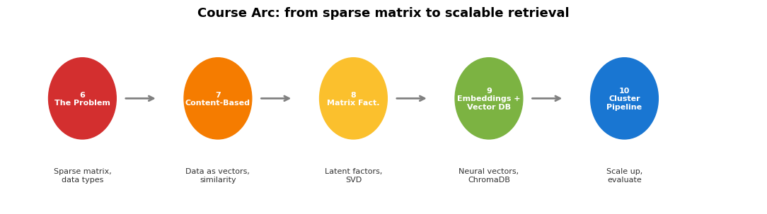
Key Takeaways
Recommendation = predicting missing entries in a very sparse matrix
Data comes in many forms: ratings, text, images, clicks
Core challenges: sparsity, long tail, cold start
Collaborative Filtering uses rating patterns to find similar users — elegant, but breaks on cold start
Path forward: represent items as vectors in a feature space, so we can recommend even without rating overlap → next lecture